Friday, November 30, 2012

MDS Blog Hop - Sketch!

Oh, I am SO late getting my post up today! I figured out a little too late that my blog post for today posted to my writing blog by accident. That's what I get for having two different blogs at one time. UGH! Well, it's late now but here it is!

We had a sketch to do from here:  I love sketches and pages with lots of photos, so I thought I'd do one of a collage of Audrey baby pictures. She was such a cute little bald baby - we had a good time looking at all of these last night while I was working on the page.

I used a lot of cardstock, ribbon and some overlay stamps on this page, and the title was just made up of all kinds of fonts (love!)

Hope you have a great weekend and don't forget to visit the other MDS Blog hoppers today and see what they did with this fun sketch!


Friday, November 23, 2012

MDS Blog Hop - Brushes

This week Jeanna challenged us to use brushes! This is the digital term for our digital stamps and I was all about this challenge! I LOVE using MDS's brushes. I used a stamp from my old standby favorite brush set (Frames with a Flourish) and one of my new favorites (Neon Notes).

And a little tidbit of information, these were my wedding colors 11-1/2 years ago! (Purple and Silver).

Thanks so much for stopping by the blog today and be to check out the other blog hop ladies for some brushy goodness!


Friday, November 16, 2012

MDS Blog Hop - Scrapbook Your Childhood

This week I challenged the My Digital Studio Blog Hop ladies to scrapbook something about their childhood. I had such a fantastic childhood, and this guy right here is a good part of the reason why.

I love my dad! We are so much alike and butt heads a lot, but he really is the best Dad. When I found this photo strip in an old box of photos, I knew I had to scan it - it's so funny and typical of photo strips back in the 70's. The first frame cracks me up, you can see the "Is this thing working" look on our faces? LOL

Now for some of the fun kits I used to make this page! Oh, and a disclaimer - I didn't have a high-res version of this photo so I did the page as a 5"x5" page so if some of the elements look really big, that would be why. Some of the kits I used were: Downtown Grunge, Neon Notes, the striped background paper was from the Days to Remember kit, and the big blue circle is from the More Candid Frames download. Enjoy! :)

Now, you know the drill! Be sure to check out the other childhood scrappin' ladies and see what they've come up with for today!


Friday, November 9, 2012

MDS Blog Hop - Holiday Goodness!

I *LOVE* the holidays! Wouldn't I a person with the name of Holly who was named after Christmas (even though I was born in May!) HAVE to love the holidays? Yes! So I love this week's holiday challenge.

I've been overdosing it on scrapbook pages lately so I wanted to do something a little different. When I saw the "Tags" template on MDS (speaking of MDS, have you downloaded your new complete MDS update yet?) I knew I wanted to make some! How fun would little MDS tags on your gifts be?

This first one -->
uses the Christmas Cocoa II kit (love the papers in this one!)


My husband makes the best homemade Chex Mix the weekend before Thanksgiving that we give out to family and friends in little tins and I thought these tags would be great to put on the tins.

This second tag uses some of my favorite holiday papers, from the Wintergreen Digital Paper Pack and the Snowflake Trimmings punch kit. I love how festive these are, they're getting me in the Christmas spirit already (all I need now is a little bit of that homemade chex mix!)

Be sure to visit the other blog hoppers today and get your MDS Holiday on! :)


Friday, November 2, 2012

MDS Blog Hop - Circles

I love the page I have to share with you today (Circles!!!!), but I forgot to hit the Publish button before I came to work this morning! (ugh!) When I get home from school in a few hours I'll get it posted, but until then, continue on with the hop and I hope you'll stop back later!

Friday, October 26, 2012

MDS Blog Hop - Slacker Central

I was SO hoping to get a page done today, the theme was Owls and I have a 9-year-old daughter who absolutely loves them, but I'm organizing a huge fundraising scrapbooking crop for our school this weekend and I just wasn't able to get this week's challenge finished. Next week I will be back!!!

Don't be a slacker like I was and keep going with the hop - I'm sure Kimberly has something amazing to share with you today!


Friday, October 19, 2012

MDS Blog Hop - Inspired by...

To say I was excited about today's challenge was an understatement. We were challenged to CASE or be inspired by the person under us in the hop. Know what that means? I HAD KIMBERLY VAN DIEPEN!!!!! Holy cow I love her stuff, Batman! And let's just say that it didn't take me long to be inspired by this post on her blog. I never scrapbook myself. I hate pictures of myself. But then I saw her post, and I read it, and I poured over that amazing page she made of herself. But what really stuck out for me was that she said, "Life is short and I want my kids to know who I am. This includes the good, the bad and the ugly." Yep, that's it. That's what I don't do, but really need to do. So, beyond thank you for the inspiration, Kimberly. And here's my good, my bad, and my ugly all wrapped up in one page.


Now be sure to check out the other CASE-ing and inspiring going on around the hop today! Hopefully something will inspire YOU!


Friday, October 12, 2012

MDS Blog Hop - Ribbon, Ribbon and More Ribbon!

I had so much fun with this week's My Digital Studio challenge! The challenge was to use LOTS of ribbon on a project so I made my entire background with them. It was so easy and not as much work as you think it would be. I laid out the four rows of ribbon, then on the top menu chose ARRANGE, then GROUP. Then once they were grouped, I copied the group (EDIT, then COPY) and pasted them (EDIT, then PASTE) a few times to cover my background. Then I layered lots of fun embellishments and my photo on top of them.

So that's it!
Easy, right! And more ribbons that you can ever imagine! Now, don't forget to go check out what ribbony goodness my fellow blog hoppers have for you today - just follow the links below!


Friday, October 5, 2012

MDS Blog Hop - Halloween!

Good morning! And it is a good morning in the VanDyne house, the girls don't have school today and I don't have to work. Yay! (Which also means I'm on time with my post today - don't faint!)

Today we were challenged to do something, anything having to do with Halloween. Last year I did a paper card like this for our holiday card day and it was a hit, so I wanted to re-create it digitally for this challenge. BUT I wasn't sure how to do the hair (for the paper one we just chopped up a black Top Note shape and glued it on top). Can't really do that in MDS! But what I could do in MDS is use the new Freeform tool in MDS2. (It's in the right-hand menu, right below "Stamps")

With the Freeform tool you can click "Add Brush Layer", then choose the color and size of your brush. It will let you draw anything on anything! For a doodler like me, I love it! I used it to add Frank's mouth too.

I put Frank on a tall postcard and used layered punches for his eyes and nose (and face with the Top Note!).

I hope you have a wonderful weekend and don't forget to go check out the other Halloween MDS Hoppers this week - the links to their posts/blogs are below!


Friday, September 28, 2012

MDS Blog Hop - Pinterest!

First, I apologize for being so late with my MDS blog hop post today! I had finished my page last night and went to put up the post before work this morning and thought - I hate it! UGH! The colors were all wrong and ugly and I just couldn't put it up until I got it fixed (when I got home from work).

Our challenge this week was to copy something from Pinterest - how fun is that??? I have TONS of stuff just sitting out there waiting to inspire me, but I chose this one. I can't figure out who made it to give credit, but I just love it. So here is my version with my sweetie Nat.

Funny thing - I used the same sheet of Designer Series paper for everything on this page (from First Edition) - I just layered colors over just about everything to mix it all up.

I also have something fun to share - today is my FIVE YEAR Stampin' Up! Anniversary! I received a pretty 5-year pin in the mail from them today with a sweet letter, and my DSM sent me an email yesterday as well. What a fantastic company Stampin' Up! is to work for. :)

Here are the links for you to check out what lovely things my fellow MDS blog hoppers did today with their Pinterest inspiration!


Friday, September 21, 2012

How is it Friday already? WOW! This week just flew by and while I have a My Digital Studio creation to share with you, it doesn't follow the theme which is coloring stamps in MDS2. :(
Today I'm going to share another page I created for a MDS convention sample that did not get used at convention. For some of my convention pages I dug out some of my old photos and while adding this picture I realized that I used the SAME picture on one of my very first blog posts from four years ago when I started Create Something Everyday.

Now don't forget to go visit the other super-talented hoppers today! :) And have a WONDERFUL weekend!


Friday, September 14, 2012

MDS Blog Hop - Card Sketch

This week we did a card sketch for the MDS blog hop and it was SUCH a cute sketch - you can see it here. It's so cute I feel like I didn't do it justice.

OK, so I had to laugh when I saw the new the new Fancy Frames download this week. One, I LOVE them, they are just my style. And that's the funny thing - does this green frame I used look familiar? Try looking here. So did Stampin' Up! happen to find the same frame I used or did they paint mine? :)

Now, how did I miss this stamp in the Fantabulous You digital stamp set? Seriously, this could be my mantra. I have more crazy ideas than I have hairs on my head. I LOVE IT! Yes, I need to send this card to myself. ha ha!

Supply List:
Background
     Designer Series Paper\_Designer Kits\Floral District - designer series paper\Floral District - 12

Embellishments
    Staple & Stitching\Black - Simple Stitches zigzag
    Fancy Frames\Fancy Frames - lucky limeade

Stamps
    _Designer Kits\Days to Remember\Days to Remember - heart bold, Color = 254,211,91
    Fantabulous You\Fantabulous You - trust your crazy ideas
    _Designer Kits\Days to Remember\Days to Remember - heart bold, Color = 148,192,197
    _Designer Kits\Days to Remember\Days to Remember - heart bold, Color = 164,174,60

Punches
    Extras\Comfort Cafe - banner, Fill Color = WHISPER WHITE 255,255,255
    Extras\Comfort Cafe - banner, Fill Color = WHISPER WHITE 255,255,255
    Extras\Comfort Cafe - banner, Fill Color = WHISPER WHITE 255,255,255
    Borders\Scallop Edge Punch,  Filled with: Designer Series Paper\_Designer Kits\Floral District - designer series paper\Floral District - 13

Photos
    Designer Series Paper\_Designer Kits\Floral District - designer series paper\Floral District - 19
    Card Stock\Whisper White

Now head on over to the super-talented Kimberly's blog and see what she's done with the sketch today and have a FANTASTIC weekend! I'll be writing, writing, writing trying to get ready for a writers conference I'm going to next weekend. I'm so excited!


Friday, September 7, 2012

MDS - Birds of a Feather

Happy MDS Friday to you!
Today we were challenged to do something about food, and although I almost always try to stay on topic, this week was insane for me and I wasn't able to get to it.

So instead, today I'm going to share a page I did as a My Digital Studio Convention sample that didn't make it to the sample boards.For this page I used the Birds of a Feather content disc. At first I wasn't sure how I would use the items on this CD, but WOW! After using it, I couldn't stop. The colors (fantastic!), the birds (love!), just everything!

Now go check out what yummy things the other ladies in the hop have to show you today! :)


Monday, September 3, 2012

A Quick "Hello" on Labor Day

Happy Labor Day! I hope to celebrate, you have the day off!. Today I'm sharing a card we did for my Technique Tuesday card club in August.

For those of you long-time CSE blog readers, over the years have you been able to tell my favorite color collection? Yep, Brights have always been and will always be my absolute favorite (although on this card I swapped out my favorite Old Olive with Lucky Limeade instead). It just added a little bit more of a color punch to the card.

And I only embossed the colored cardstock squares with the Fancy Fan embossing folder, I just layed them all out the way they would be on the card inside the folder and ran it through the Sizzix Big Shot to emboss them. Then I pieced the pieces back together when I adhered them to the card. The supply list with links to my online store is below.

This is really a pretty simple and fun card. Hope you are having a great holiday! I still have a few orders to deliver, if yours is one of them I will be getting it to you early this week. :) I've had a sick Audrey, who is finally starting to get better.


Sunday, September 2, 2012

Thoughts and Prayers

Years ago when Thoughts and Prayers first came out I couldn't get enough of it. Absolutely loved it! But over the years, I kind of forgot about it. Which is sad because it's really such a pretty set. Now, I have the old double-mounted wood set. Back when I got it, Stampin' Up! didn't have a clear stamp option. But the cool thing is that with this new catalog, Stampin' Up! now offers this set in clear too!

I love the new Champagne Glitter Paper, and thought it would look so beautiful with all of the browns on this card. I also used one of my favorite tools Stampin' Up! offered, the Spritzer tool! Just add the color of Stampin' Up! marker you want to use and push the ball to spray some ink. You're able to see it a little better if you click on the image to see a larger version of the photo.

Hope you enjoyed the card today and hope you're having a wonderful holiday weekend! If you'd like to purchase any of the products used on today's card, you can just click on the product photos below. :)
Supplies Used:

Friday, August 31, 2012

MDS Blog Hop - Favorite Downloads

Jeanna challenged us this week to create something using our favorite downloads. How fun!

Today we're finishing our second week of school and I have a little one home sick already (ugh!) so it's been that kind of week for me. For the past three years I've been the Art teacher and the Librarian at school, but this year I'm also teaching the computer classes. I have a Computer Science degree so naturally I wanted to do it, but it's a lot more on my already full plate. It felt so nice to get on MDS last night and have a little "me creative time"! I was going through withdrawal!

Now, I adore black and white. It's so classy and gorgeous. And when I saw the new Essentials Designer Series paper download that was all black and white papers - I couldn't download it fast enough. Yep, it's my new favorite. :) And could the background paper match her shirt any better? Wowzers!!! If you look closely at the large photo of Audrey you'll see that it has a very light overlay over it. I love that it adds a little texture to it. Just put a stamp over your photo and bump the Opacity setting down really low. I think this one was set at 15. If you click on the image above you'll be able to see it better. I also cropped the stamp so it was the same size as the large photo.

Did you know that you can create supply lists SO easy in MDS2? It's such a cool feature! In the right menu just click on "Check Project", then hit the "Supply List" button and it will list everything out for you (like below!) I'm adding the links to the products I used there so if you find any you can't live without either, you'll have easy access. :)

Thanks so much for stopping by today and don't forget to follow the hop with links under the supply list - I'm sure the other girls have some amazing eye candy waiting for you today and I can't wait to see what everyone's favorites are!

Supply List:

Background
Embellishments
Stamps
Paper
Continue hopping with the links below!

Sunday, August 26, 2012

How-to Video - Stampin' Up! Fabric Flowers

I think I may have been one of the last demo's to hop on the fabric bandwagon. Funny, since I love to sew. But I love to sew on PAPER. Not fabric. And since all of the patterns on Stampin' Up's fabric is also on their paper, I thought "Well, wouldn't that just be silly to have the paper AND the fabric?"

Thank goodness I've come to my senses. You can quote me on this, "I CAN'T GET ENOUGH OF THE FABRIC." So much that it scares me just a little. I've been playing with it all so much that I created a little video for you showing how I made this fun little fabric flower with only four "ingredients".


If you haven't tried the Designer Fabric yet, now would be a great time to play around with it and see what fun things YOU can come up with!

PS - I apologize for the sometimes shakiness of the video, it was filmed by Audrey who only did it if I made a deal with her to show her how to use my sewing machine when she was finished. (and a sewing monster was born!)


Friday, August 24, 2012

MDS Blog Hop - Postcards!


It's Friday, it's Friday! And you know what time day it is - My Digital Studio blog hop day!

This week I challenged the talented MDS blog hop crew to create a postcard. It could be any theme, etc. the only requirement that it just be a postcard.

I've been wanting to design a digital "Thank You" postcard to give out to my customers for years now, and just never got around to doing it. Well, thanks to the MDS challenge I finally did.

For this card I used my favorite kit, the Spring Break II kit for my embellishments and background papers. Then I used the First Edition kit and the Staples and Stitching kit, and on the back the little "Made just for you" stamp is from the Creatively Yours digital stamp set. And now that all of our printed digital items are 31% off until September 14th, I'm excited to finally get these printed! At that price, it's silly not to!

Now I'm off to check out the other MDS blog hoppers and I can't wait to see what postcards they've come up with! I'm sure you'll want to check them out too, don't forget to click on the names/links below to see more digital inspiration in postcard form!

Wednesday, August 22, 2012

Stippled Blossoms Love!

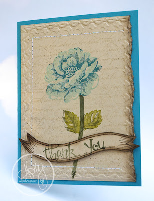
I looked at the Stippled Blossoms stamp set in the catalog and thought "Eh..." and I'm a HUGE lover of flower stamp sets. So I didn't buy it. Then I went to convention where they used it in one of my classes and

BAM!

I fell in love. Hard. When I got home, I had to get it. Immediately. And I love, love, love it. Can't stop using it! We did this card for a workshop a few weeks ago. The background uses the En Francias background stamp, and the banner is from another new favorite set of mine, the Decorate A Daisy stamp set.

I embossed a little, inked a little, and sewed a little. I used Island Indigo and Pool Party for the flower, and Old Olive and Always Artichoke for the leaves, stem and greeting, and Crumb Cake for the cardstock and the background stamp ink. Oh, and I dimensional'd the "Thank You" banner.

Thanks so much for stopping by and taking a look today! I've been off the blogging grid for a few days, I started back to school Monday and the kids started today so I've been knee (OK, neck!) deep in school paperwork, organizing, lesson plans, etc. It's been fun but I can't wait for the weekend! :)

Sunday, August 19, 2012

So You Want To Take Your Own Photos?

Let me preface this post with the disclaimer that I am not, nor do I think I am a professional photographer. I'm just a mom who likes to take pictures of her kids. I've picked up/figured out a few techniques and tips along the way so I thought I'd share them on my blog today. (Don't worry, tomorrow I'll be back with something crafty!)

I took the girls out for a shoot this morning so I'd have some examples. We have an amazing place here called Kingwood Center. It has amazing grounds and beautiful gardens - perfect for taking photos. Which leads me to my first point.

Location.
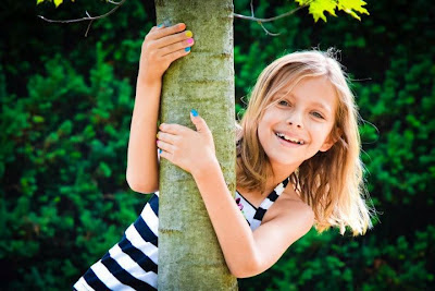
You may not have a Kingwood Center near you, and that's OK. Beautiful nature surrounds you, you just have to look for it. My cousin, Megan Dill took these AMAZING photos of my cousin Kim and her family in their parents' backyard. Last year I took the girls downtown where there are brick streets and parking lots. Even with my photo of Audrey here, just a tree makes great scenery. And don't forget to keep your eye on the background behind your subject. It's much easier to move your subject if the background doesn't look good, than to try to take it out after the picture has been taken.

Lighting.
When taking outdoor shots I try to either do them before noon or in the evening when the sun is setting. When noon hits and the sun is directly overhead it makes harsh shadows (yuck!) and it will make your subject squint (also yuck!).

Get them comfortable.
I've heard mom's yell at their kids when they don't smile for the camera and I'm pretty sure yelling at them is not going to fix the problem. I don't know about you, but my kids aren't big advocates of doing what I tell them to do. So when we go out for a shoot I encourage them to make goofy faces. It gets them comfortable with the camera and with me snapping pictures behind it. It also helps to have a camera with a fast shutter speed so once you get that goofy picture, you can get the one a second or two later when they're laughing about it. Who doesn't love a picture of a kid laughing? And you know what? I LOVE the goofy pictures too. Isn't Natalie going to love us when her dad and I show her boyfriend this picture when she's in high school?

It's OK to be serious.
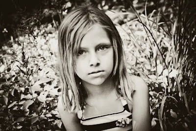
While we're talking about facial expressions, let's talk about smiling. Or better yet, let's talk about not smiling. It's natural to see a camera and want to smile. I think it's embedded in our brains from when we're little that when you see a camera, you smile. But when I see my kids day in and day out, I see them smile maybe 10% - 20% of the day? When I'm 90 and look through my photo albums I also want to remember what they look like without their mouths stretched out to their ears. I love the simplicity of normal. So when I'm taking photos I often tell my kids not to smile so I can remember what their normal looked like someday.


Don't look at me. Look at anything BUT me.
Your kids may think you're crazy when you tell them NOT to look at the camera, but sometimes you can get the best shots that way. For the same reason as above, I love shots like these. I want to remember them this way. Don't get me wrong, I get LOTS of smile photos. During a normal shoot I take between 200-300 photos. Normally 10-20 are keepers (if I'm lucky, a few more than that). But those shots I do get are SO worth it.

Get close.
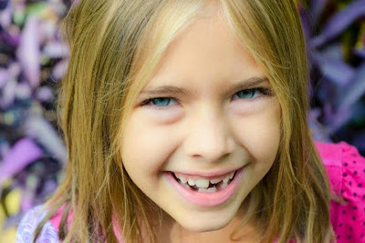
My camera zoom is my best friend. How else would I be able to see all of those missing teeth of hers? Or the front tooth that just started coming in? The beauty is in the details and it's so much easier to see them when you get close to your subject. And the closer you get, the less you have to worry about your background, because there's less room for it to show.

Move the camera.
Don't be afraid to tilt your camera and get a whole different look to your photo. Straight is completely over-rated. :) Trees may grow straight most of the time in real life, but with a camera you have the ability to do whatever you want to with that straight tree (and the kid leaning against it). I think it all comes down to this - don't be afraid to try different things. Experiment! See what works best for you and what gets you the best photos. Photos that YOU like and will treasure for the rest of your life.

One final note is that you don't have to have a big, fancy SLR camera to take great pictures. Sure, it helps, but I can get fantastic photos with my $99 point and shoot Kodak camera too - it's all in how you frame the photo and what you make of it. To process my digital photos I use Adobe Lightroom and a whole bunch of free presets that come with the program and that I downloaded from the internet. It's a fun program to play with and adds so much to your photos. I'm sure you'll be seeing more from the shoot today in my My Digital Studio projects in the future - so beware! :)